Sunday, December 7, 2014

Vizio SmartTV

Vizio SmartTV


    One of Vizio's first attempts at the SmartTV is a quality LED TV, but not much else. Being LED, Vizio took advantage of the benefits of the technology in the design of the TV. It is light for 60" weighing only about 40 lbs. LEDs are incredibly bright while also being energy efficient, as well as leaving a small physical footprint. Therefore, this TV resists glare well and is only an inch and some change thick. It displays 1080p quality images very crisply, and the 120Hz refresh rate allows for high quality retention in fast-paced scenes. However, outside of the hardware, the software is lackluster at best, and a straight up hassle to use at worst. The UI design for all the apps is a small linear menu at the bottom of the screen when the Vizio menu button is pushed, and while this style of menu works well when everything animates smoothly (PS4 has this same design, and it feels snappy), all of the menus are slow and buggy on the Vizio SmartTV. The apps themselves are often worse, glitching every few action inputs and freezing up consistently. Updates were a constant interruption, so much so I had to turn them off and forget I had a "smart" TV at all. Once I did, I actually really started to enjoy it as a TV and much less as a hub for my media. 

Thursday, December 4, 2014

Jaybird Bluebuds X

Jaybird Bluebuds X

   The Jaybird Bluebuds X are a pair of wireless Bluetooth headphones designed specifically with the athlete in mind. There are a number of good features and, while only a few, some bad aspects of the design as well. On the good side, they are very light given that they house both audio and Bluetooth hardware. They are completely sweat-proof, and this isn't like a "says they are something proof and that something break it in a few days" kind of claim. They are not only extremely moisture repellent, Jaybird even backs these with a lifetime replacement warranty if these do break from sweat damage. Another fantastic spec is the 8 hour battery life, and since I've tested them that number has held true. A calming voice alerts you when there is only 15 mins left of battery, and speaking of the calming voice, "Jenna" is a Siri of sorts that feeds notifications to you about calls, music, battery life and more. It is apparent Jaybird wanted the user to just put these on and go, and gave the user a few ways of doing so. The Bluebuds can be worn under your chin or behind your neck, and these options work well in keeping the damn things on your head. A lot of design work is needed to really nail multiple position wearing across a number of users, and in the Bluebuds it really shows. Out of all of that, the sound quality is SUPERB for Bluetooth. It is as close to high quality wired ear buds as Bluetooth is going to get according to Jaybird, and after owning more ear buds of varying qualities, I'm inclined to believe that statement. A few negative things about it maybe cannot be helped. For one, Bluetooth is Bluetooth: it's come a long way, but there are still times where it cuts in and out even when the phone is in my pocket. These occasions are rare and therefore overlook-able, though when it does happen it's a real annoyance. Since they are powered by themselves, running out of juice is a real possibility. If you run out of battery on the road or away from a place to charge them, they become useless. Even though the two hour charging time for 8 hours of playback time is a good ratio, it means nothing when a charge isn't available. So, in short, while I'm still getting used to them and using them as my daily driver, I would only recommend these broadly to those looking for headphones to wear during workouts and sports (or you are cool with carrying around spare headphones in case these run out of battery.)

Thursday, November 6, 2014

Furman Moodle

   So, as something we are all forced to work with, Moodle deserves a review, but it won't be a pleasant one. There are a number of things very wrong with Moodle's design. First, the new version of the desktop site is buggy. Graphics float in front of others that shouldn't be doing so, already clicked links turn the same color as the purple on the site background, and links are busting all the time. The mobile version isn't the best either. It's evident that, given the current design choices of the full site, a vertical take on Moodle doesn't do it any favors. All of my personal choices like to my profile stuff is located at the bottom of the page after all the moodle quick tip stuff. To top it all off, Furman's network sees Moodle as a threat to the security of the students and flags it as such. This requires that extra step of telling the network that our main hub for all things academic isn't trying to give me a Trojan virus.

Thursday, October 30, 2014

Taco Bell Mobile App

Taco Bell Mobile App

    Last night, consumed by hunger, I saw a commercial for this application I could download from Taco Bell. This blog will be a review of said app. The picture on the left showed the main screen, and a pro here is definitely aesthetics. Ample use of screen space, stylized pictures with bold text overlays...the designers clearly understand common modern design staples, but it lacked a lot of upfront information that could have helped me. Their menu browsing is actually really enjoyable! They have two independent scrolling menus, one the categories on the menu and another to show the actual items in the selected category.
    But whoa.... hold the phone... this app lets anyone mobile order Taco Bell?!?! Damn right it does, but that's one of my cons for this app. While it was apparent from the start that this feature was available, I was given no indication as to which stores actually participated in taking mobile orders. When I was all done coding what I wanted, then, and only then, did I find out that no stores near me took these orders. I should be able to check store availability before I go through the whole process.

Wednesday, October 15, 2014

Braun Electric Razor Series 7

Braun Electric Razor Series 7

   I've had this razor for over 5 years, and I would say it's...suitable. Of it's positive features, there are a few that stand out but maybe not for this model specifically but most electric razors. It has a meter at the bottom to signify the remaining battery level with a good amount of detail. The shave itself is quite nice...on most parts of the face (more on that in a bit) and the flip-up trimmer works very well without pulling hairs. Another major aspect is its extremely waterproof body. In the shower or just running it under the sink, the series 7 is still good to go and watertight through and through. To clean the blade itself, one just needs to pushing in the locking button on the side (seen in picture) and the razors come right off, which helps with cleaning.
   There are a good number of poor design features that often make me consider a new razor all together. The razors themselves are situated in a linear pattern. While the sides independently give to applying pressure, which allows for more contact, it shaves awfully around the more sharp contours of the face and neck (the jaw line is a great example). Also, if it were dropped, even from a very short distance, the razor's locking mechanism throws a fit and misfires the button, sending the razors flying in whatever direction. Lastly, the price of a razor replacement is $80, which is crazy expensive over time given it claims you should replace them every "4-6" months.

Sunday, October 5, 2014

HTC One M8

HTC One M8


      I did a review on the case for this phone, so I'd might as well do a design review of the phone proper. The HTC One M8 has been called "The iPhone for android users" and I would say that is pretty accurate. This phone is built very solidly, with a full metal body and many material transition techniques akin to Apple's manufacturing process. It comes with a number of features in both hardware and software that are brilliant inclusions while others are a bit underbaked. In the good features corner, the front facing stereo speakers provide amazing sound quality for a phone, and MAN are they loud. With the massive sound system playing in our apartment, these speakers just overpowered them for everyone on the couch. Another feature I've appreciated is the IR Blaster. IT acts as a universal remote, and I mean UNIVERSAL. You can download IR information for any device under the sun, and you can import custom IR information by pressing the button in question on another remote into the IR blaster of the phone, essentially creating a clone of that button. The software of this phone has been streamlined to be snappy and include only what is necessary. HTC Blinkfeed puts all of your social networks, news sites, and calendar info in one spot, acting as a central hub to your life. 
      I have some issues though. The "Duo Camera" on the back....I'm undecided about it. The second camera records depth information of each picture taken by the other camera below it, allowing for some cool effects to happen after. You can refocus after the picture is taken, but this only works about one third of the time. Speaking of hardware, with a phone this tall (5" screen and speakers at both ends results in a lengthy device), putting the lock button at the top wasn't the smartest idea.

Thursday, October 2, 2014

Bose SoundLink II Speakers

Bose SoundLink II Speakers

     I have had these speakers for about 2 years now, and I couldn't be happier with the design. It is built in such a way that it feels solid through and through yet not encumbering in the slightest bit. The best way to describe it would be dense and compact. The speaker connects via Bluetooth, and it is hands down some of the best sound quality I have ever heard from a standalone Bluetooth speaker. The battery life is surprisingly long, giving about 5-6 hours on above medium volume. Speaking of volume, this speaker is LOUD. I mean loud enough that, on full volume, it actually warranted a noise complaint from neighbors a few apartments away! My favorite design feature is the double duty protective covering.
     It is designed in such a way that when closed, it acts as a rugged protection for the speaker screen. It does a great job in both protecting an adding extra aesthetic quality to the speakers. When unfolded (as seen in the first picture) it acts as the stand for the speaker itself. This duality of essential purpose is something I have always admired in designs; having more than one function that is a core part of the product just shows ingenuity and a real understanding of the product being delivered. This speaker set isn't perfect though. The bass is passive, which means while it is remarkably strong, it needs some object behind it to reflect the bass to the listener to really get the full effect. Otherwise, it is diminished quite a bit, though it is aided slightly by the angle of which the stand rests the speaker. It bounces the bass of the...well...base it is resting on (be it a table, the ground, etc.). The stand itself is rather short in the back, so knocking the speakers over is rather easy. Other than these small things, the Bose SoundLink 2 is a Bluetooth speaker system I would highly recommend to anyone looking for a durable, portable, and powerful speaker (I found mine refurbished for just shy of $200)

Thursday, September 25, 2014

Roomba: The Smart Little Vacuum

Roomba: The Smart Little Vacuum


    Recently, our apartment purchased a Roomba Discovery and our floors have never been cleaner! This little device comes with some impressive physical features along with intuitive AI algorithms to be as effective as possible. On the physical end, it has a rounded bumper in the front to know when it hit a wall or some other object (duh). This is obviously crucial for a self maneuvering robot, and it works really well (most of the time). Aside from having a clean setting and a max setting (clean setting but longer), there is a spot clean option where it will spiral out in a 3 foot radius and then come back in for a really thorough cleaning job. When it comes to the software, it has a few behaviors that work in the architecture known as subsumption architecture: a hierarchy of actions ranking in precedence depending on the stimuli it receives like IR information and wall contact. It will wander as a base behavior, and when given commands from the remote, it will put that behavior on hold and let you, the user, guide it around the room. The docking station is my favorite feature because it sends out two IR beams in a cone shape and when the Roomba is low on battery, it will find that IR cone and isolate between the two beams as it drives towards the dock, essentially parking itself perfectly every time!
      Like any piece of technology, it isnt perfect. It needs a flat surface to drive on, so shaggy rugs, clothing, and larger objects it can ramp up on will get it stuck indefinitely until the user can free it. the battery life is also quite low, so if it can't find its way back to the dock in time, it will just die, on the floor, and make a sad defeated noise :(. Lastly, if it gets stuck under a small table or a chair, the bumper is big enough to have it hit a leg, spin around to go another direction, hit another leg, then circle under the piece of furniture forever. (The bright side is that spot will be REALLY clean).   


Tuesday, September 16, 2014

The iPhone and iWatch Reveal

The iPhone and iWatch Reveal

     So Apple finally pulled the trigger with their take on this new generation of hardware along with the newest iteration of the traditional tech. Before I give my thoughts on the thing going on my wrist, I have a few things to say about the thing going in my pocket. The new iPhone 6 was presented in the way Apple does best: delivering a stunning, state-of-the-art presentation of the industry's most middle-of-the-road technology.


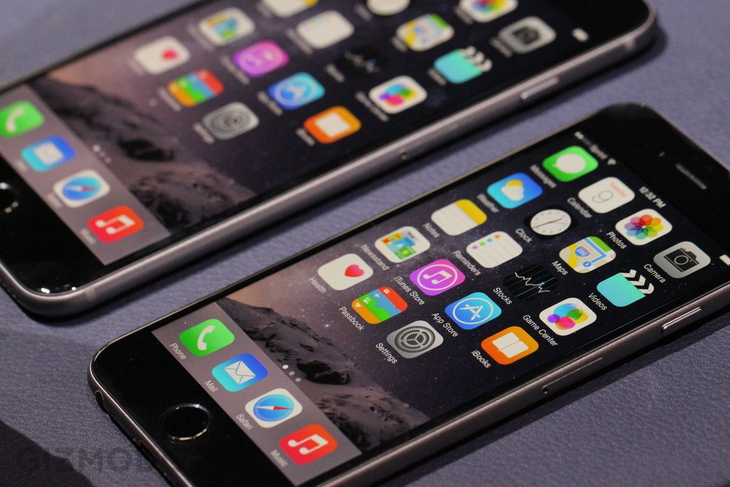
    The video was beautifully crafted and made it look super pretty. However, one must strip away the pretty wrapping paper and compare the phone to the competition.  Literally every piece of that hardware (aside from the fingerprint scanner) has been substantially lapped. 1334x750 pixels on a 4.7 inch screen? Phones smaller than that have had 1080p full HD screens for a year and some change at this point. 2GHz dual-core 64bit processor chip? The phone currently in my pocket, nearly a year old, is rocking quad core 2.2GHz 64bit. 8MP camera? Samsung Galaxy phones have had 13MP cameras since the Galaxy 4 was announced ages ago. However, like I mentioned earlier, it's top notch presentation, but also application of said technology too.

   Though this technology is dated, it's time tested, easily accessible, and malleable enough at this point to put it into an extremely attractive package. Sure, other smartphones have internal components that would run circles around computers from just a mere few years ago, but often times phone companies have to make it a piecemeal job to stuff it all together. With Apple, they have made a truly seamless (in many places literally) experience with dated technology which in itself is impressive. The hardware itself looks like it doesn't have edges; not just a lack of corners and angles but actually lacking creases and places where two different materials meet. The software (which I have played around with) finally could stop playing catch up to Android and allow for control of your device in ways yet to be seen by consumers of any camp. Apple is, again, delivering a stunning, state-of-the-art presentation of the industry's most middle-of-the-road technology, and there isn't necessarily anything wrong with that. Only time will tell how much of a wave this version of the world's favorite phone will make, but my guess is it will be the software that will be producing conversations.

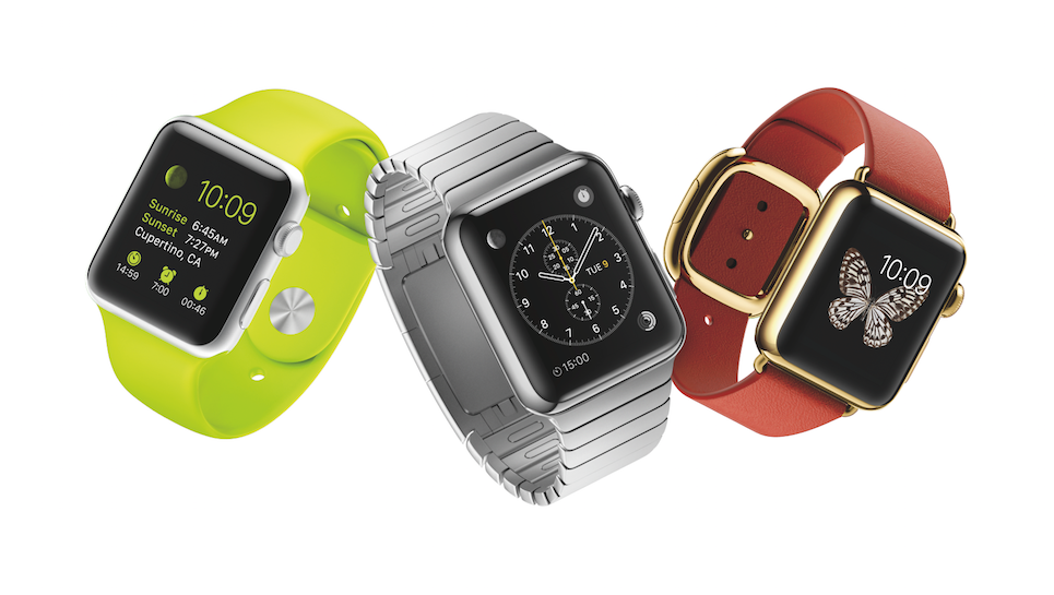
Now as for this watch...


      I honestly can't make heads or tails of it. There are a lot of really innovative design features and options like the slew of easily removable wristbands, the digital crown interface, and the magnification style software. They all work in tandem to make a seemingly easily navigable and fantastic LOOKING product, but if you couldn't tell by my caps, I have my skepticism with most first iterations of almost every piece of tech, and Apple is no exception.

      After seeing all the software side of things, I have yet to see anything it can do worthwhile that a current smartphone cannot besides be on my wrist and throw a few gimmicky things at me (I'm looking at you, weird drawing widget thing). It may be a reservation with the idea of the watch concept all together at this point, but then again I don't feel nearly as hesitant with Android watches. They are much more open to inclusion of third party influence, which will result in a faster growing ecosystem of watch specific features that will make the piece more standalone. The iWatch, and most things Apple for that matter, never had that same openness. If Apple wasn't making the drastic changes in how the user interacts with the software of its products, then tough s***, you have to wait until Apple churns out an "official software update". All that being said, this smartwatch is laying down the groundwork for something potentially groundbreaking, but until Apple or one of its approved associate companies breaks said ground personally (think Nike), all it's going to do is providing a limited experience and saving you the .7 seconds needed to pull out your phone.

Wednesday, September 10, 2014

HTC One M8 DotView Case

HTC One M8 DotView Case

     So when I got my most recent phone, it was perfect for my needs. Fast, sleek, and packaged all of the features I needed into a single device. It did, however, have one glaring issue: the physical design was so slick that holding it was a bit of a nightmare. It was like holding a bar of soap. So I decided to search for cases that added some grip to my phone. I picked up the DotView case and it had one really cool feature:
It allows for the case to be closed by a mesh that lets information through in a unique dotted design. It would show messages, time, weather information, email updates, and missed calls to name a few. However there are a few big design flaws...

     First, the whole DotView interface relies on you swiping and tapping over the front mesh. However, the mesh is pretty thick, and current touchscreens work by detecting your finger's natural electric conductivity. Because the plastic mesh is in the way, touch input is rarely accepted (maybe 1 in 3) when, in theory, you are supposed to interact with the phone in a number of ways fluidly in this manner. Second, the mesh flap doesn't close all the way when it flips around like a book cover. So it always protrudes from the back of the phone by almost an entire inch, making this case nearly impossible to hold without the flap getting in the way or making the phone awkward as hell to hold.

Thursday, September 4, 2014

Bringfido.com Map Duality

Bringfido.com's Map Duality

    Over the summer. I worked for three months on helping Bringfido.com, a pet friendly travel booking site where all listings allow pets to stay in the space, improve their design and make it more aesthetically and functionally pleasing. I did this by scouring the internet for all the travel sites I could find and evaluate their positive and negative features (It ended up being 19 pages with pictures, I can show anyone who cares to see it). This was an interesting way to encounter a case study that incorporated both good design features and frequently clunky interactions. I am going to relay a single feature that is a fantastic example of both!
     
      Bringfido.com managed to do some novel things that even the bigger sites wouldn't try. The most notable was the map method of searching for a destination. It not only allowed for exclusively finding a location through the map itself, but if it was moved by the user with search results on the page, it would live update the results based on the currently viewed geographical location. Another impressive feature was localized advertisements. If I were looking at a place to stay in Charlotte, the ads would only show businesses that were in the Charlotte area. They wouldn't be travel ads either, but rather dog kennels, parks, groomers, and other places people with pets would actually use while there. This is a direct extension of holistic design in that the designers thought not just of the service it is providing, but thought about what the user will need throughout the entire travel experience.

     However, this map is a source of agony for everyone in that office for a number of reasons. For one, it takes up the majority of the screen as soon as you traverse to the search results page. If your mouse is anywhere over the 75% of the screen the map occupies, it will instantly zoom out with the intensity and speed of a space shuttle. This will result in completely changing the search results and losing the results you were looking for. Every. Single. Time.  On top of that, the listings it shows are never really complete. If you were to zoom in farther, you are greeted with many more qualifying results. While this specific flaw isn't inherently awful, it does make for an annoyance when you have already booked a hotel only to find one later that is closer to where you want for much cheaper. This strange duality of innovation and glaring oversights makes for an interesting case study on how a single aspect of a site can be both positive and negative at the same time for the user.